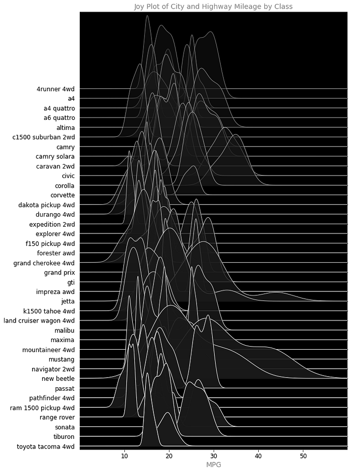
WHAT IS A JOYPLOT
Joypy is the python library and ```joyplot()``` is the function to plot the figure. There are a few other libraries that have these types of plots: ```Seaborn```, ```Bokeh``` I think maybe ```plotly``` does too, to name a few. There’s even a package called ```timely-beliefs``` that has a pretty gnarly example as well. I don’t know why, but I’ve always thought these were such cool visualizations.

HOW WOULD YOU USE IT?
It’s basically a violin plot put horizontally. You could use it a million different ways. Anytime you had multiple histograms you wanted to see in a single plot. I always used it to show fraud rates for rules (xaxis = fraud rate and yaxis = individual rules). There’s a bunch of ways to display this type of information though. This is just a good looking one imo.
CODE FOR THE FIRST IMAGE
#import the libraries
import pandas as pd
import joypy
import numpy as np
import matplotlib.pyplot as plt#set some display options
pd.set_option('display.max_rows', 500)
pd.set_option('display.max_columns', 500)
pd.set_option('display.width', 1000)#import the csv
df2 = pd.read_csv('C:/Users/mbade/Downloads/datasets-master/mpg_ggplot2.csv')#create a color gradent function to be used in the colormap parameter
def color_gradient(x=0.0, start=(0, 0, 0), stop=(1, 1, 1)):
    r = np.interp(x, [0, 1], [start[0], stop[0]])
    g = np.interp(x, [0, 1], [start[1], stop[1]])
    b = np.interp(x, [0, 1], [start[2], stop[2]])
    return (r, g, b)#show the table
print(df2.head(20))#plot the figure
plt.figure(dpi=380)
fig, axes = joypy.joyplot(df2
                          , column=['hwy', 'cty']
                          , overlap=2.5
                          , by="model"
                          , ylim='own'
                          , x_range=(0,60)
                          , fill=True
                          , figsize=(10,13)
                          , legend=False
                          , xlabels=True
                          , ylabels=True
                          #, color=['#76a5af', '#134f5c']
                          , colormap=lambda x: color_gradient(x, start=(.08, .45, .8)
                                                             ,stop=(.8, .34, .44))
                          , alpha=0.6
                          , linewidth=.5
                          , linecolor='w'
                          #, background='k' # change to 'k' for black background or 'grey' for grey
                          , fade=True)
plt.title('Joy Plot of City and Highway Mileage by Class'
          , fontsize=14
          , color='grey'
          , alpha=1)
plt.rc("font", size=12)
plt.xlabel('MPG', fontsize=14, color='grey', alpha=1)
plt.ylabel('Car Model', fontsize=8, color='grey', alpha=1)
plt.show
IMAGES
There’s too many ways you could create the plot; it could have bins, or be transparent or have background colors, or have less overlap, or be thinner etc. etc. Here’s just a few I was playing with this morning.


CONCLUSION
In any case, these always make for good conversation. Mostly starting with “what kind of plot is this?!”
Cheers!
